Omnipod Automated Delivery Restriction Alert
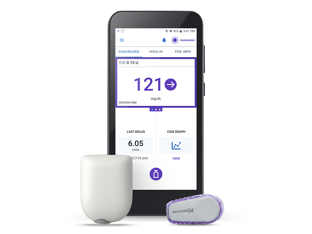
Proposed Behavior Scenarios
What was decided for how the system should behave, and where the user interacts with the notification in these high level workflows. The alert would be separated into two scenarios and the system would remain in Automated mode.
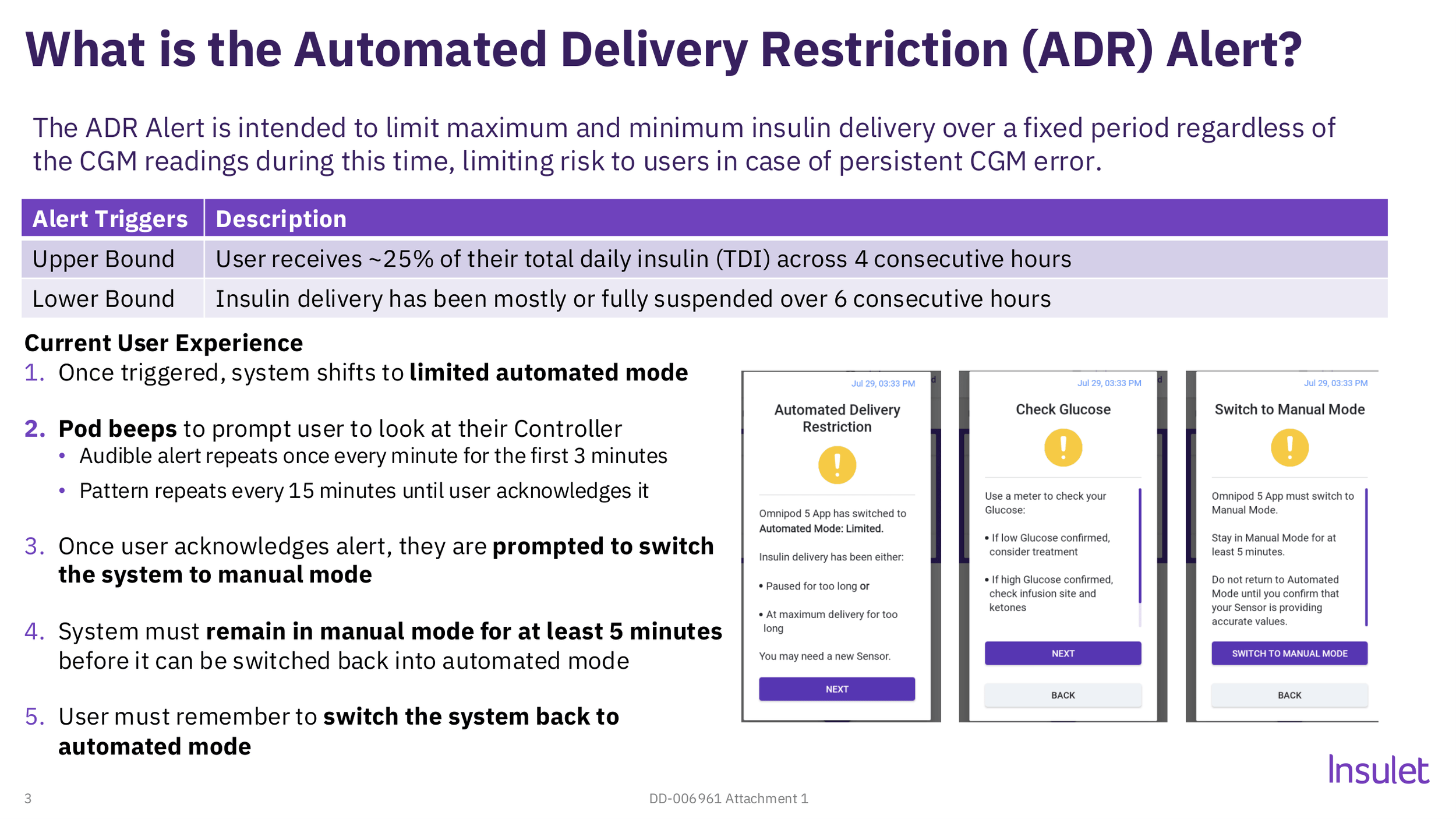
Project Overview
Improving the Automated Delivery Restriction (ADR) alert. The old design through a series of informational screens, forced users to switch to manual insulin delivery while the system corrected itself. The new algorithm no longer requires switching modes for correction.

Design Role
Lead Designer (Android Platform)
Teams collaborated with: Product Management, Systems Engineering, Software Development, UX Research, Human Factors, Regulatory.
Project timeline: 3 months
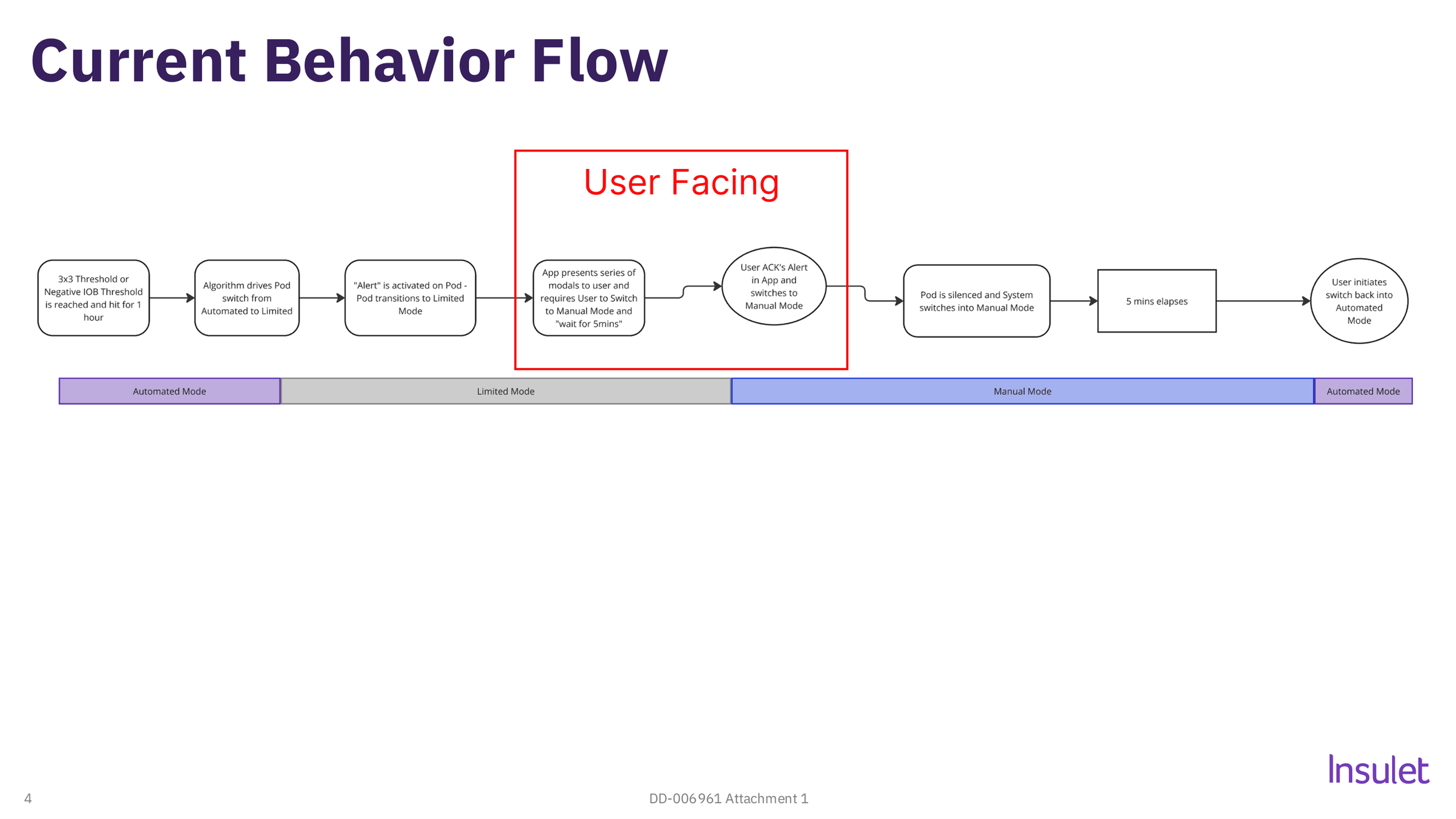
Understanding Current System Behavior
For a start, I need to understand how the system works and what the UX touchpoints are. This is a high level breakdown of what the system is doing in the background where the user interacts with alert notification.
Research
This is where the empathy part comes in. I knew the current notification design had room for improvement, but the research helped us understand the WHY on a personal level with our users.
Problems/Opportunities
Current design has a 3 screen walkthrough.
Alert forces user to switch to manual mode for at least 5 minutes.
Users often forget to switch back to automated mode.
The alert covers two different situations, so the error is unclear.
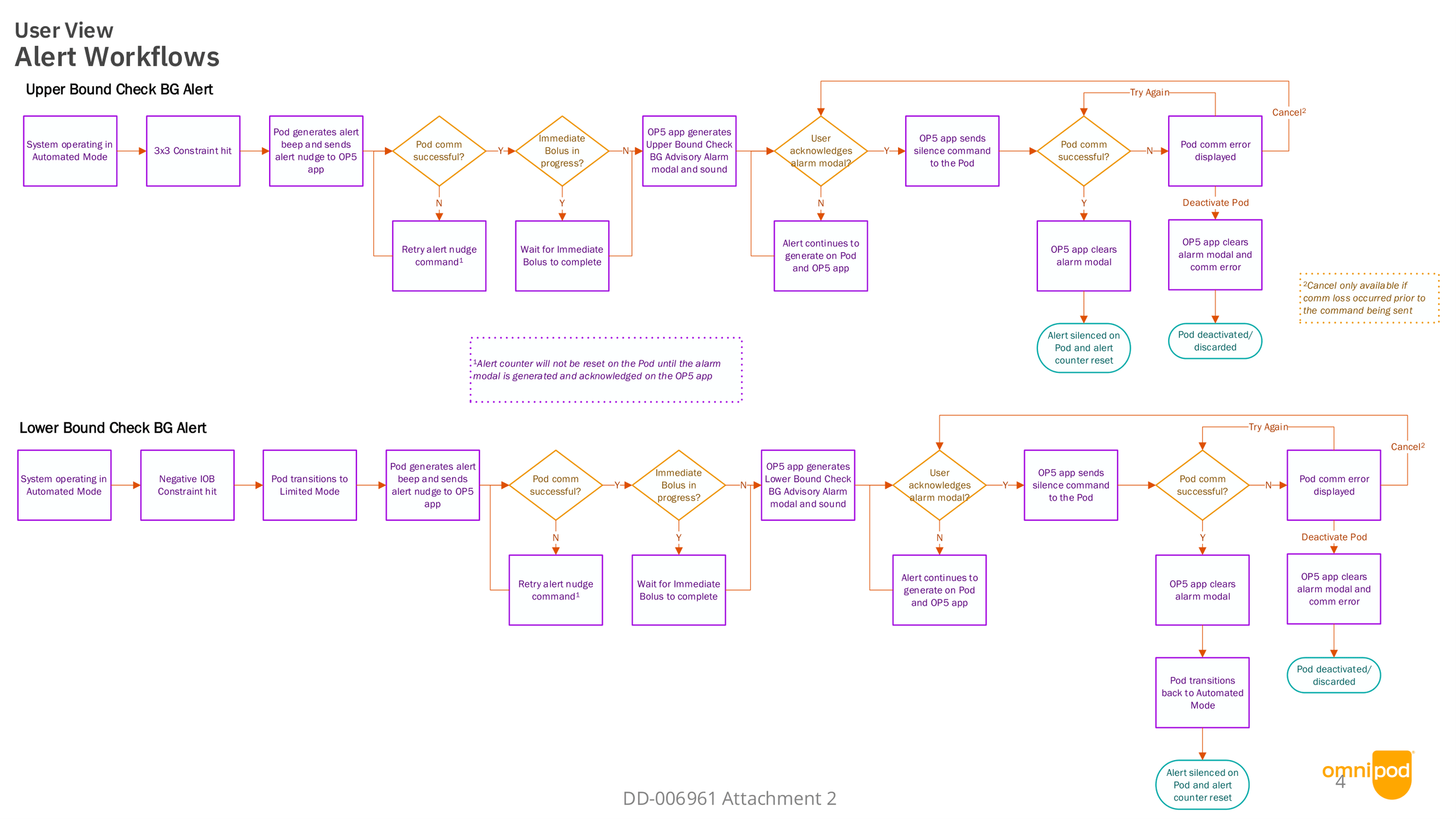
Systems Solution Workflow
With the understanding of the proposed background changes to the alert design, integrating into the systems flow for a detailed look at all possible use cases between app and Pod communication.
Design Iterations
Putting those ideas to visuals and presenting to stakeholders for feedback, and what to test with users for validation.
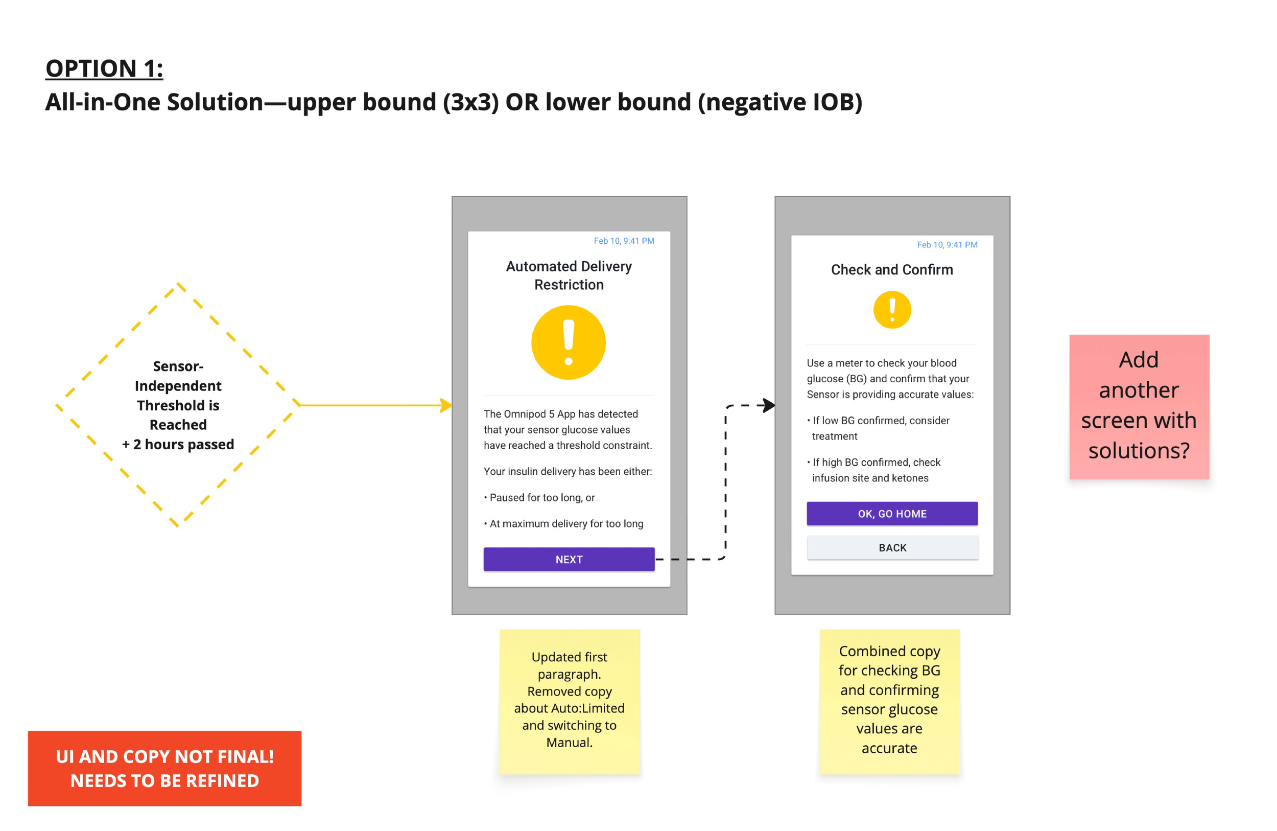
All-in-One with reduced step
Intent:
With the assumption that alert couldn’t be separated and combine/simplify the messaging of steps 2 & 3.
Outcome:
Saving one step didn’t add much value. But not requiring mode switch was praised.
Final Iteration
After testing different workflows and messaging, the following improvements were agreeed upon and finalized:
“Automated Delivery Restriction” renamed to “Check blood glucose”
Reduced number of steps to alert acknowledgement from 3 to 1.
Improved user comprehension of alert notification copy.
Distiguished original single alert into two separate scenarios.
User is no longer asked to switch to manual mode.
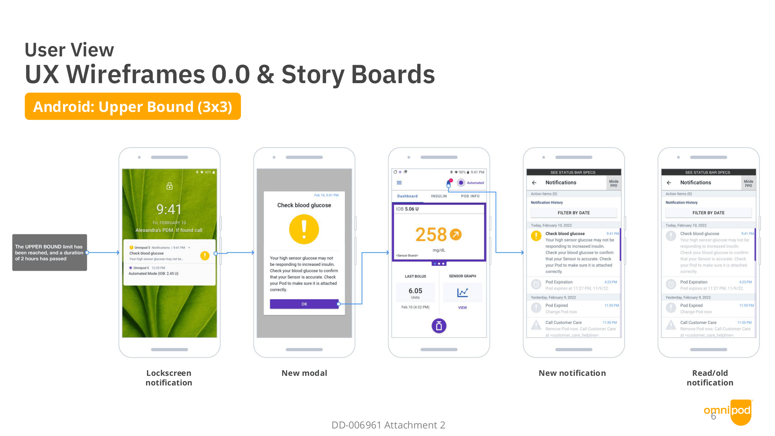
Upper Bound Scenario
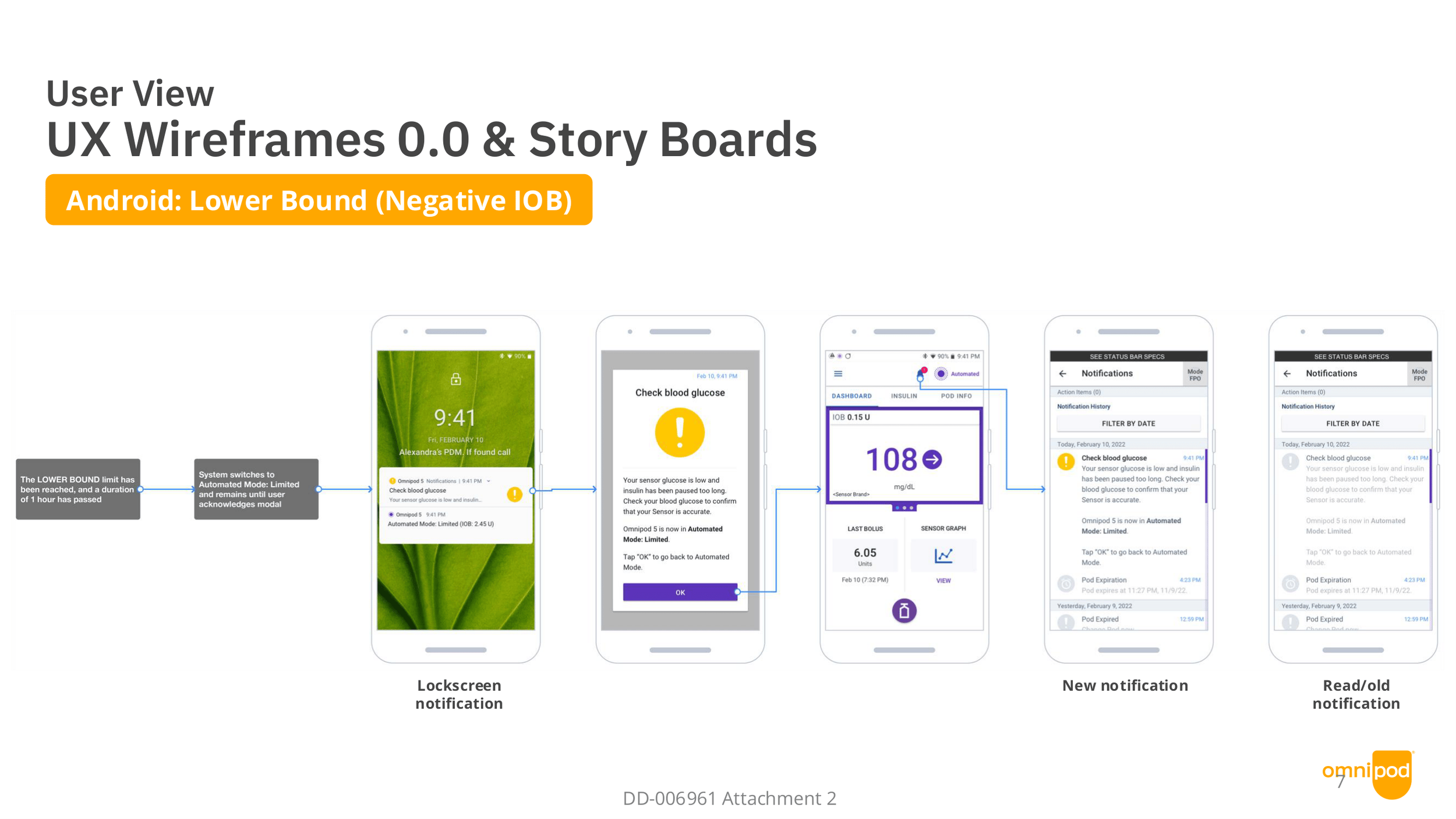
Lower Bound Scenario
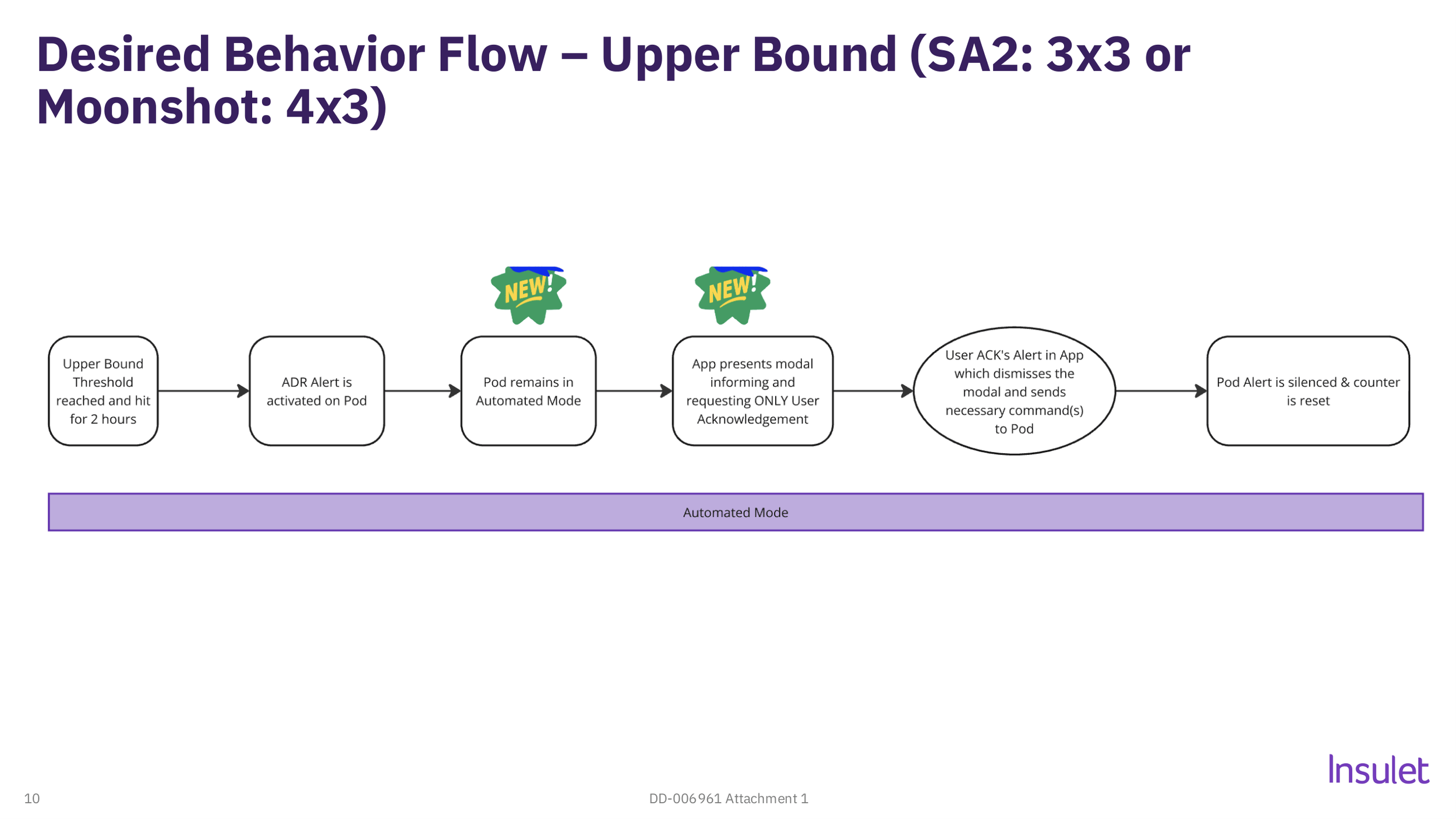
Lower Bound
System will switch to Limited Automated mode when alert is prompted and requires user acknowledgment.
System will automatically revert to Automated mode after acknowledgement.
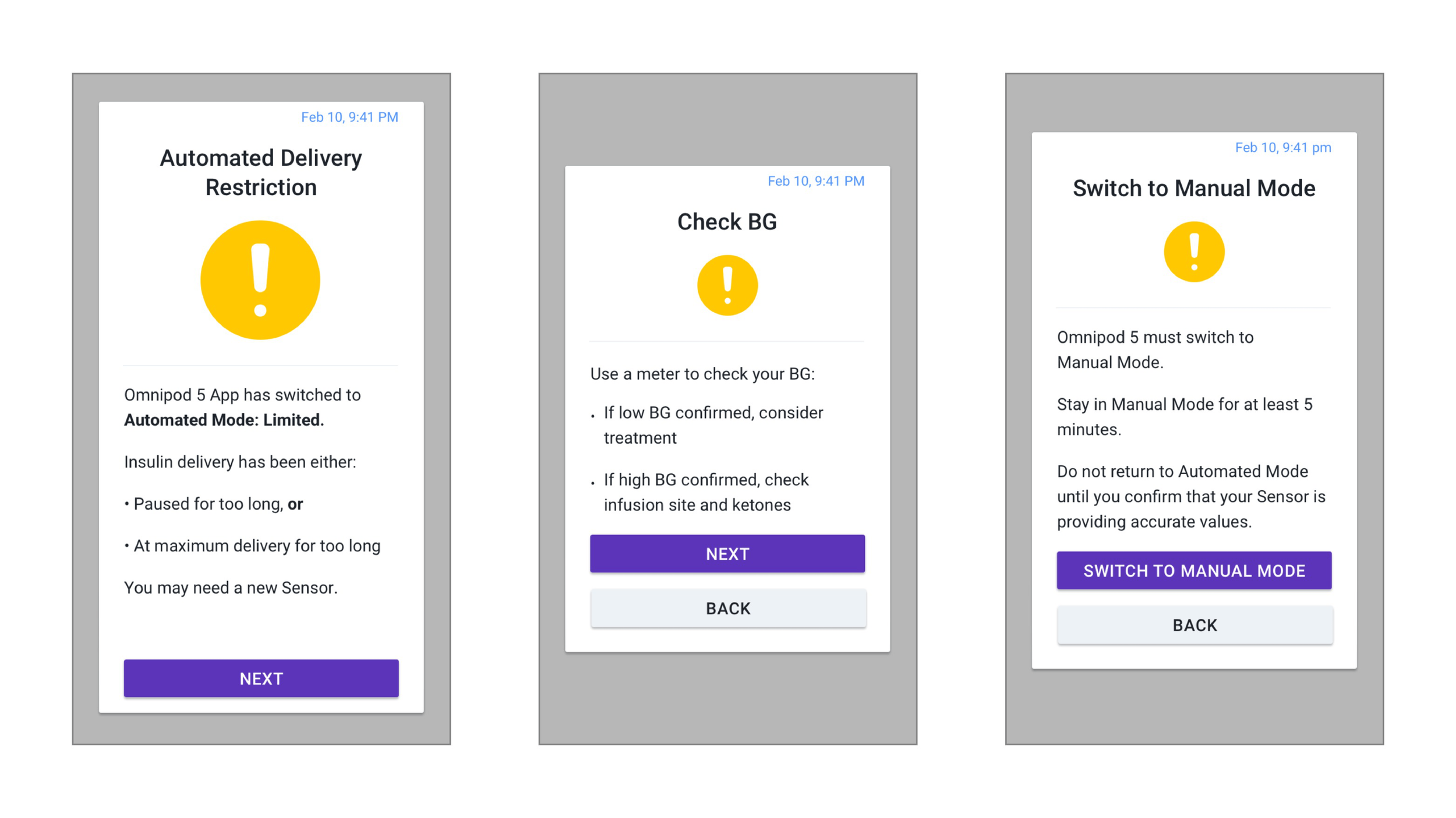
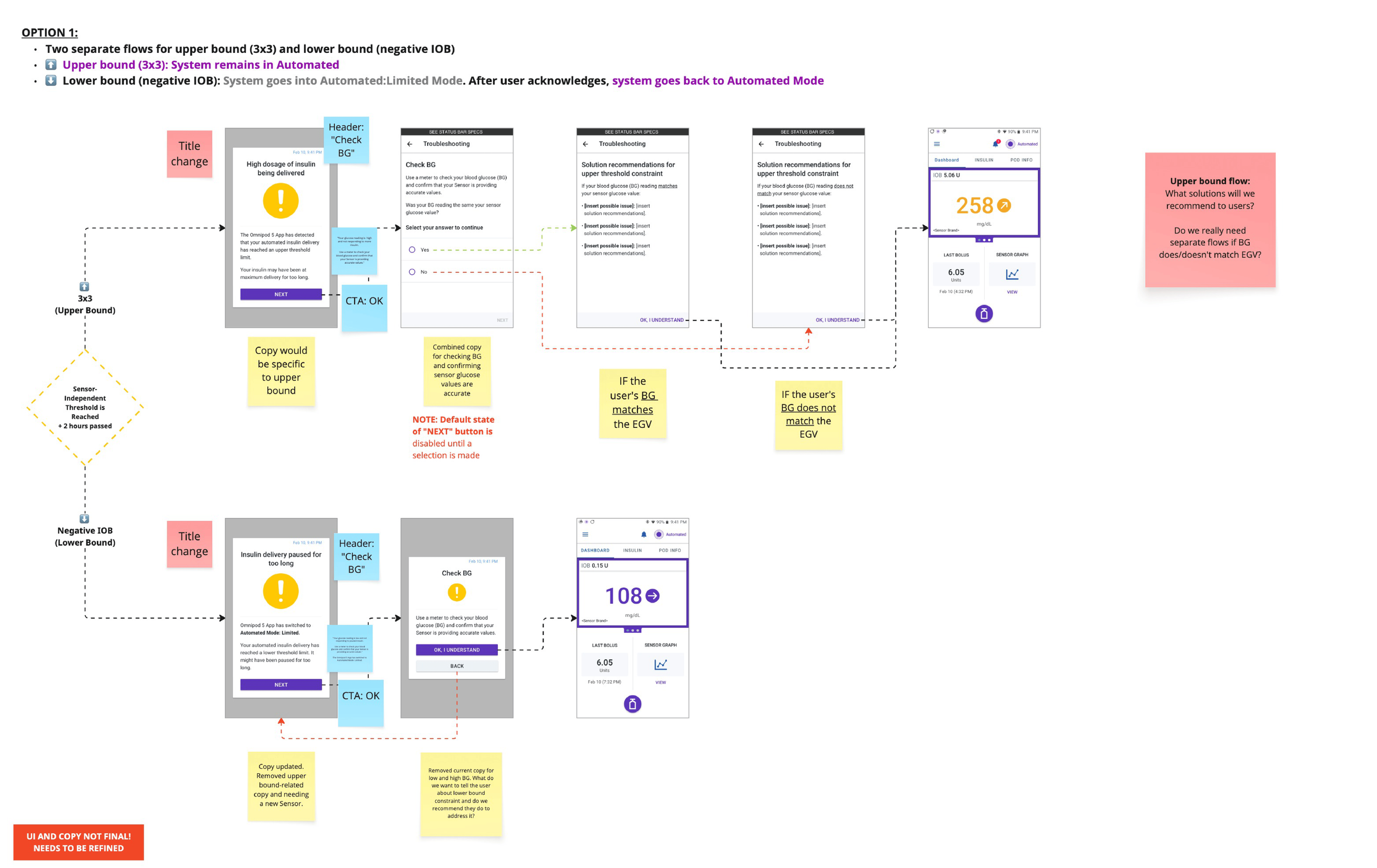
Diagnostic Walkthrough
Intent:
List possible causes and give clear, detailed fixes for the alert.
Outcome:
Lengthy process for users and extensive content-strategy review.
Upper Bound
System will remain in Automated mode when alert is prompted and requires user acknowledgment.
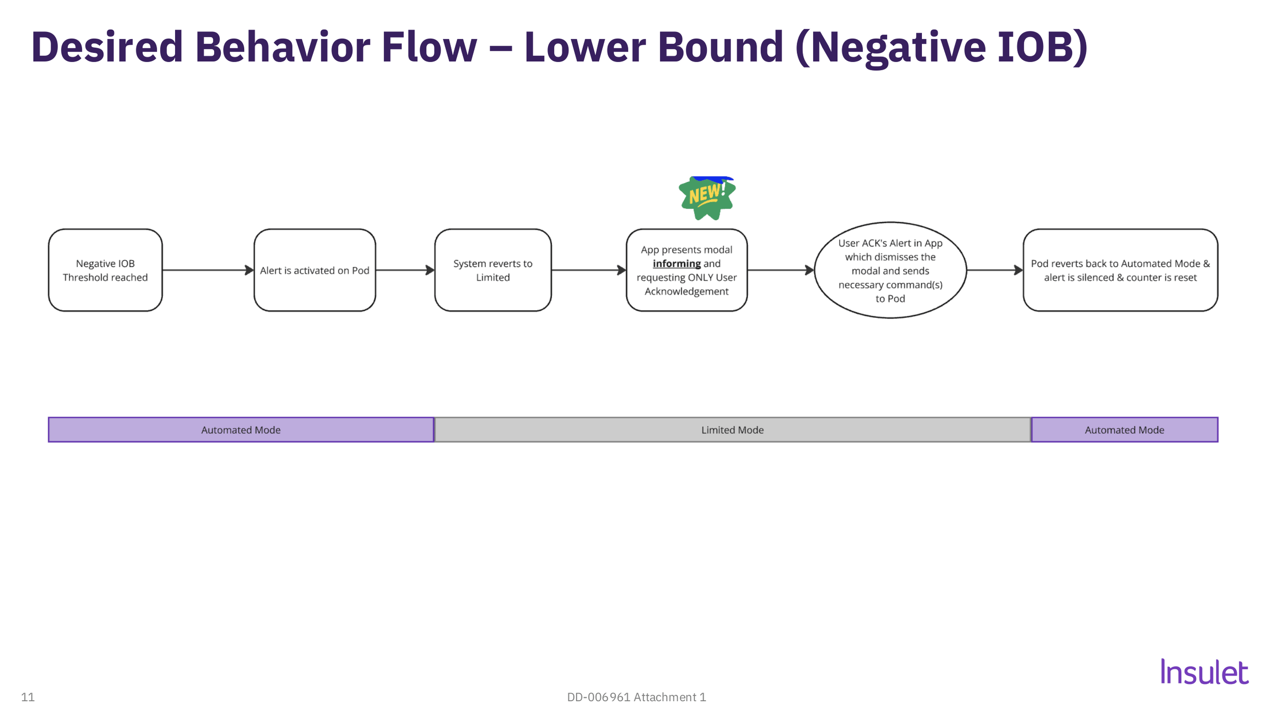
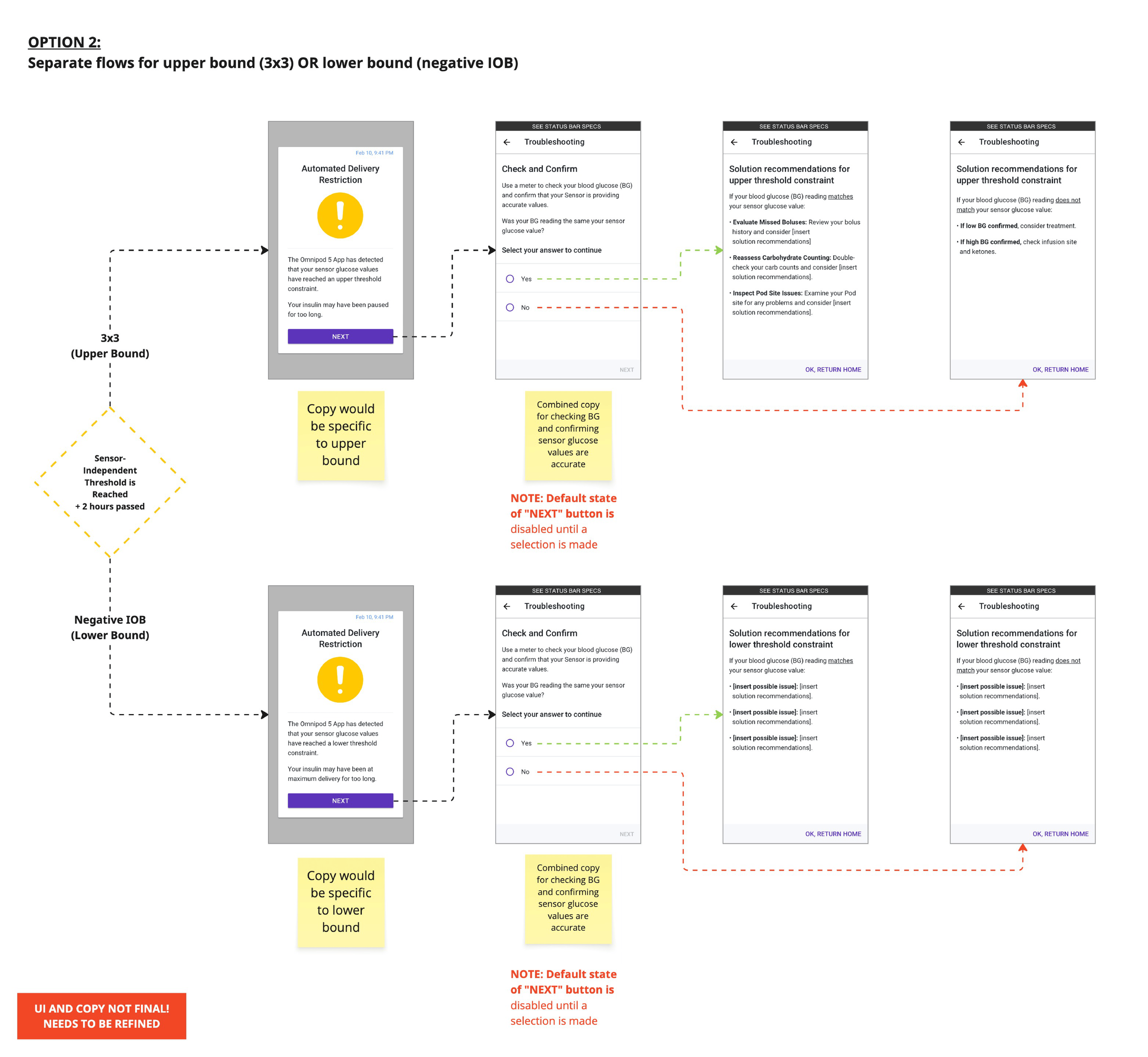
Alert Differention
Intent:
Explore differention of alerts and steps to remedy and acknowledge.
Outcome:
Concern for lenghty upper bound workflow and breakthroughs with Medical Affairs and Instructional Design teams.
Design Considerations
Thinking of ideas and areas of improvement for the new design.
Reducing steps to alert acknowledgment.
Cleaner, concise copy for resolution.
Differentiating between upper and lower bound alerts.
System corrects itself without switching modes.
Adding diagnostic walkthrough to narrow problem and solution.
Final Thoughts
This project began with a clear mandate, improve an alert. It sounded simple and we all knew the surface level problems. However this project revealed that the alert wasn't just poorly received, it was undermining the product's core promise. Automated insulin delivery exists to give users and caregivers peace of mind, and a forced manual interruption did the opposite.
The most meaningful change wasn't visual. Eliminating the mode switch and reducing three screens to one removed a moment of unnecessary stress from people already carrying an enormous emotional load.
It reinforced a belief I return to often: listening to users is the most important design tool available. Sometimes the right solution has nothing to do with the UI at all.
UX Research Findings
Confusion over Limited mode state.
Alert caused anxiety among parents of childen with T1D.
Switching to Manual mode felt disruptive.
Explaination of alert doesn’t match the current experience of some users whose glucose has been in range all day.